


When designing a data visualization, colors play a bigger role than most people realize.
10% of people have a color perception issue, so it’s important to factor this in when selecting a color palette.
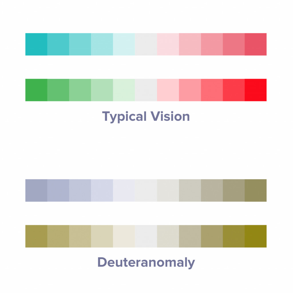
Here’s what we mean:
Check out the color scale options above for designing a heatmap. The top 2 may seem equally good to someone with typical vision.
But the bottom 2 show what a user with a color perception issue might see. 60% of these people have deuteranomaly, which means they have trouble differentiating between red and green.
For typical vision, each color scale option is about equally good. For those with deuteranomaly, there’s a clear winner.
#dataviz #datavisualizations #colors #design #designthinking #colorpalette #deuteranomaly #colorblind #ux #primitivespark