Finding the perfect typeface is hard, especially when designing an identity.
Some of the time, it doesn’t exist. So in those cases, I create it.
When I set about designing an identity, I get the creative brief out and ponder it. I sketch ideas, letterforms, symbols, shapes… I also put together a “font plate” where I go and find typefaces that could represent the personality of the company I’m designing for. I print out the font plate and sketch some more. Sometimes I draw over the letterforms with modification ideas. At some point when I have some stuff captured, I’ll go into the computer and begin executing some of the sketched ideas. It’s rare that I use a font as is for a logo. It’s almost always modified in some way, and sometimes even created completely from scratch. That was the case when we created the Primitive Spark identity. One of the fonts on my font plate was BaseNine Small Caps, and I liked the proportion of the loops in the P and R shapes to their short legs. But I also wanted a more square design language. So I created completely new building blocks and pieced together enough letters for the logo.
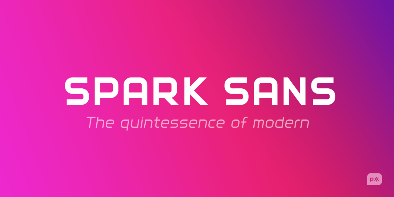
It was years later that I decided that I wanted to extrapolate this study into an entire font family. So after months of painstaking work, I released Spark Sans to the public, comprised of six fonts, each containing more than 250 glyphs. You can get it here:
When you want to express the brand personality of a company, you need to create something unique, and sometimes that means designing your own letterforms.
#identitydesign #typedesign #typography #design #ux #userexperience #productdesign #primitivespark


